With the advancement of sports analytics, there are many ways to describe and compare players with data. The issue this creates is how to break down this information into digestible chunks. How do we display many metrics at once?
One way to do this is with Opta radars. In an industry surrounded by numbers, it’s easy to forget that not everyone processes information in the same way. While some are adept at pulling out insights from a list of numbers in a table, others are more visual learners. This is something we highlighted at the Opta Forum 2023 when discussing using metrics effectively.
What Are Opta Radars?
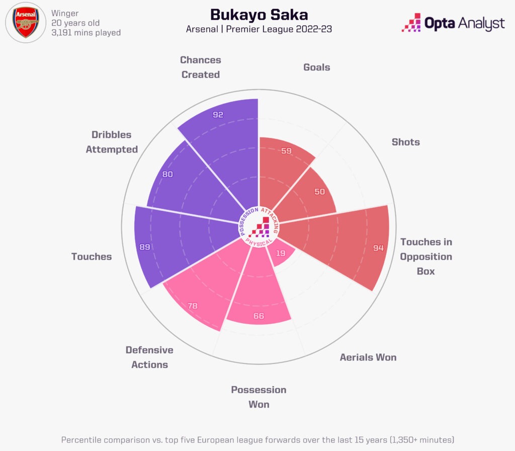
An Opta radar is a visual representation of multiple metrics in one chart, using slices to present a player’s relative strength in each metric. The distance of each slice from the centre represents a player’s percentile ranking compared to the benchmark dataset of players.
You will see these types of graphics referred to as polar area charts or pizza charts, given how each metric is represented by these separate slices, but radars are the more generalised term recognised amongst sports fans due to their wider use in video games like Football Manager and FIFA.
Understanding the Radars
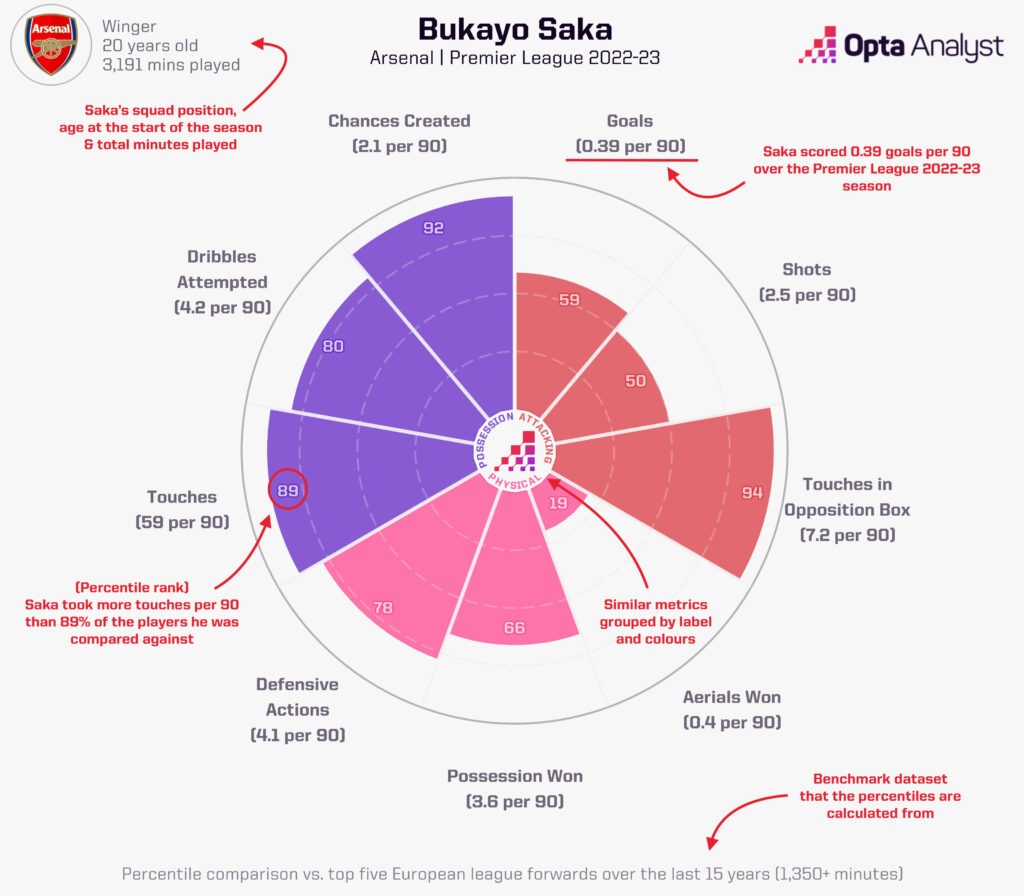
The annotated version of the Opta radar below describes what features of the radars illustrate: from the player information in the top left, to the percentiles and raw metric breakdowns for each category:
Context in the Radars
As is always the case with data, context is key. Radars allow us to quantify how a player’s output ranks against a wider population of players. In our Opta football radars, we compare player data against 15 years of top five European leagues seasons giving us over 24,000 outfield player performances.
We use individual season performances by players over this period where players feature for at least 1,350 minutes (15 full games). For example, Arsenal’s Bukayo Saka would have an entry for each of the four Premier League seasons in which he hit these thresholds.
In our example, we compare Saka’s Premier League 2022-23 performances against other forwards in this dataset. To do this, these historical performances by forwards are divided into 100 evenly sized groups for each metric. These are called percentiles, where the worst players are given a rating of 1 and the best players are given a rating of 100.
Saka’s 92 rating for his chances created slice means that he created more chances (2.1 per 90) for his teammates than 92% of forwards in the top five European leagues over the last 15 years.
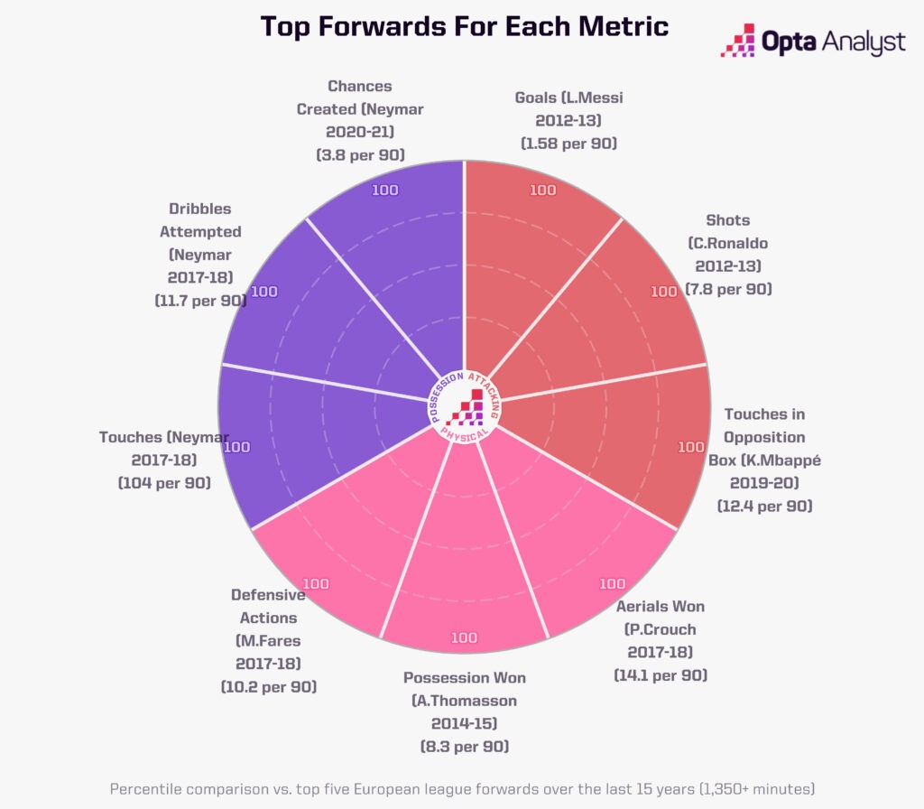
To give some perspective on these, we can build out the ‘ultimate’ player by pulling out the highest-ranked player in each category. Imagine a player with Lionel Messi goalscoring in 2012-13 with the aerial ability of Peter Crouch in 2017-18!
Choosing the Metrics
Choosing the metrics to display may sound trivial but to do so we must balance a few factors. We want to cover a range of characteristics of players while making sure the person consuming the graphic can still extract quick insights from the template.
We typically limit our templates to nine slices. Yet more reason to call it a radar rather than a pizza chart – no one out there is slicing pies into nines. They’re evenly spread across three higher-level themes, and we evaluated our choices according to the correlations between metrics to ensure we were getting unique insights from every metric we selected.
If a player takes a lot of touches, then it is extremely likely that they will also make a lot passes, so we would gain very little unique insight by including both metrics. To keep the templates as accessible as possible, we typically use traditional metrics like goals, rather than more advanced metrics such as xG.
Why Opta Radars?
Opta radars are a useful tool in an era of material where users want information in short consumable bites (have you heard of this new platform called TikTok?). The radars give the user a quick stylistic overview of a player, with metrics often grouped together to give a further snapshot of wider attributes like attacking or defensive output.
Broadcasters often refer to their ‘five-second window,’ the average time that a graphic is likely to be displayed on screen, and so the viewer must be able to understand and takeaway information in a small amount of time.
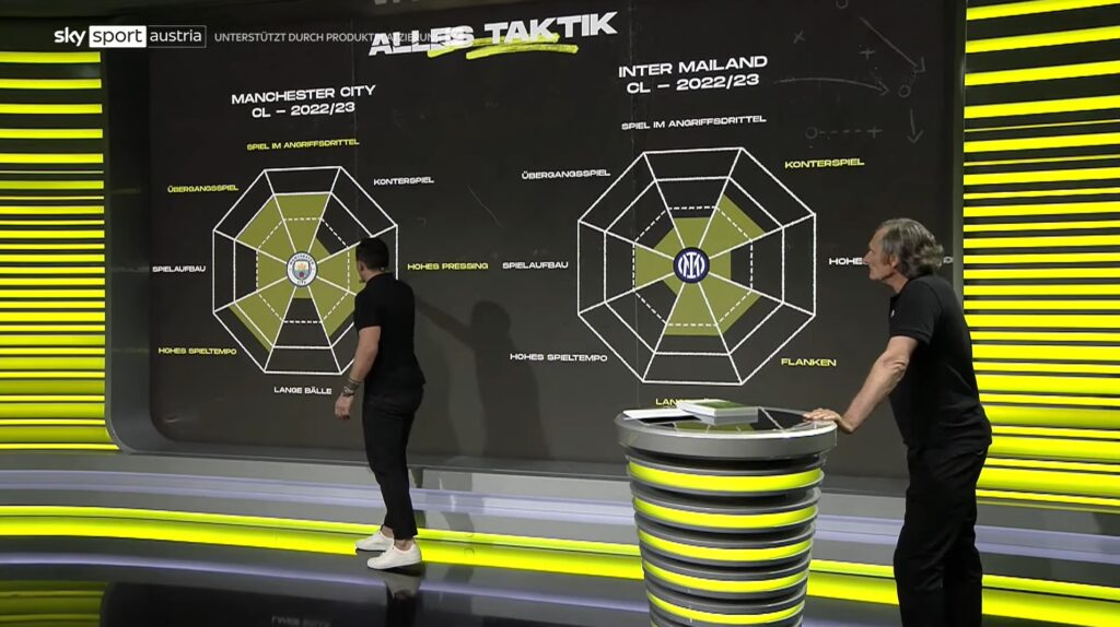
Sky Austria used Opta data in radar templates ahead of the Champions League 2022-23 final, illustrating how they can be effective in the studio to give an immediate stylistic overview between teams.
You can see how, at the player level in Opta radars, the templates illustrate the contrasting styles of Manchester City’s Erling Haaland and Arsenal’s Gabriel Jesus during the Premier League 2022-23:
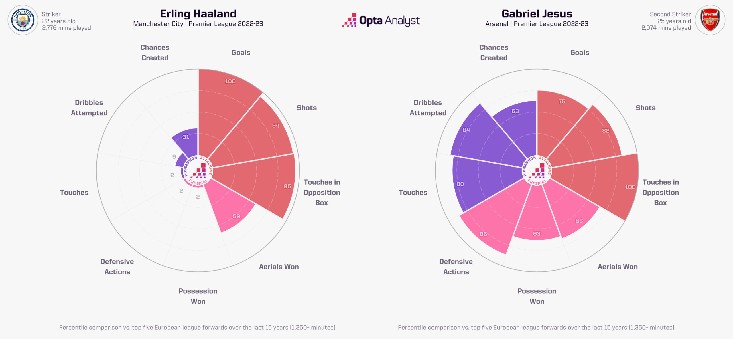
While the treble-winning Norwegian striker appears in the very upper percentiles for his attacking output, his role in the Manchester City team results in his defensive and creative contributions being far lower than his predecessor’s performances at Arsenal this season. This is an important illustration of the styles shown by these graphics and how a player’s respective role may influence a player’s output.
The most well-rounded and complete radars tend to highlight players who contribute both offensively and defensively, such as goal scoring full-backs or high pressing forwards. Alexis Sánchez in his prime years at Arsenal ranks as the most ‘complete’ forward in his radars.
A bar chart could provide a similar view of multiple metrics at the same time, but it doesn’t necessarily have the same visual impact of a radar. It’s the age-old battle in data visualisation of grabbing the attention of the audience while making it understandable for the user.
How Can We Use Opta Radars?
With a concise overview of player style in one graphic, we can apply these graphics to give us an understanding of a range of different players across different positions and different competitions.
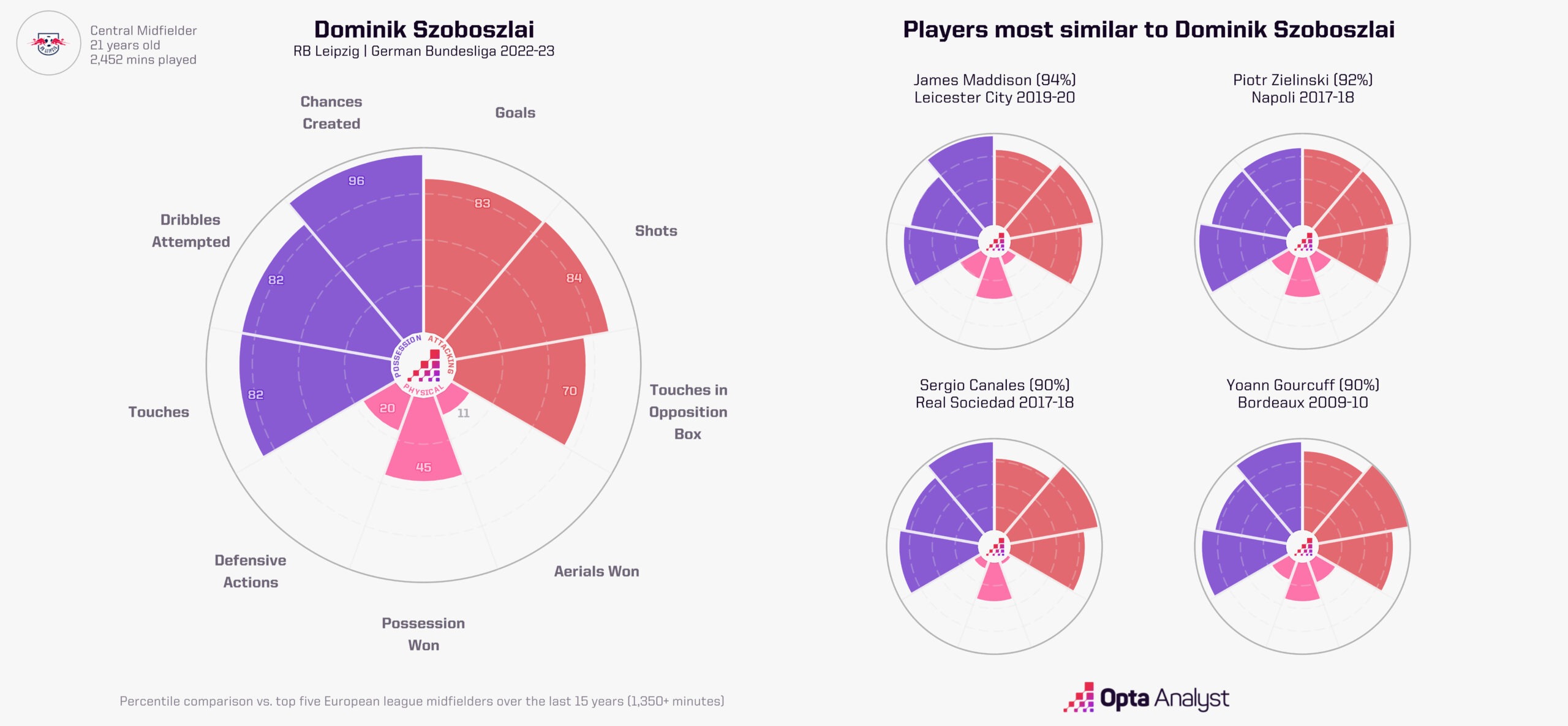
We can compare transfer targets or search for squad replacements by analysing players with similar characteristics. You can see this is at its best in this article comparing the similarities of RB Leipzig’s Dominik Szoboszlai and Leicester City’s James Maddison.
Never heard of the latest player your club has been linked to? Radars can help. Looking for a replacement for your best player? Radars can help. Scouting the most dangerous players for your upcoming opponent? Radars can help.
Radars, in various shapes and sizes, aren’t a new concept. We’ve been using them in our tools for more than 10 years in applications such as team playing styles. These are just the latest iteration, with expansion into other sports coming very soon.
Enjoy this? Subscribe to our mailing list to receive exclusive weekly content. And follow us on Twitter too.